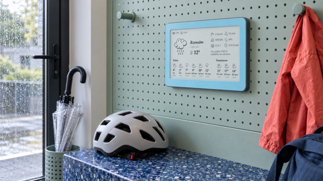
A useful home weather display does not show every number a forecast service can provide. It shows the few signals that help you decide what to wear, what to take and whether a plan needs to move. For most households, the strongest starting set is current or feels-like temperature, the next meaningful forecast change and rain timing. Wind, daylight and air quality belong when they regularly change what someone does.
The quick rule is simple: give every metric a job. If a number never changes a coat, commute, cycle, walk, school run or outdoor task, it probably does not deserve permanent space. A calm display is not a smaller weather website. It is a decision surface that should be readable in a few seconds from the place where the decision happens.
Start with the decision, not the data menu
Name one recurring moment before choosing a layout: leaving for school, cycling to work, walking the dog, opening a market stall or planning an evening run. Then write the question in ordinary language. “Will I be cold?”, “When is the dry window?”, “Will the wind make the ride unpleasant?” and “Is the local air-quality advice different today?” each point to a different metric.
A compact display usually needs three layers. First is now: the condition you meet at the door. Second is next: the change that may alter the plan. Third is the exception: a signal such as strong wind, poor air quality or unusually early sunset that matters only on some days. This hierarchy is more useful than giving every available field equal weight.
- Now: current or feels-like temperature and a plain-language condition.
- Next: the next meaningful change in temperature, rain or wind.
- Exception: daylight, air quality, UV or another value only when it changes a real choice.
- Freshness: a visible update time or another clear way to judge whether the screen is current.
Build a daily weather briefing around one real routine →
Temperature: show the number people can act on
Current air temperature is the easiest baseline for clothing and comfort. It is often enough when conditions are calm. Feels-like temperature can be more useful when wind, humidity or strong sun makes the day feel different from the measured air. The Met Office explains that its feels-like value combines air temperature with factors including humidity and wind to better represent human experience outdoors.
Met Office: why temperature and feels-like can differ →
Do not automatically make both values large. Choose one primary number and use the other as context when the gap is meaningful. A morning temperature also needs a direction: warming sharply by afternoon, holding steady or falling before the journey home. One small later value can prevent a better-known current number from becoming misleading.
Rain: separate chance, amount and timing
Rain probability, expected amount and timing answer different questions. Probability asks whether measurable precipitation may occur at a place during a stated period. Amount estimates how much may fall. Timing asks when the wet interval is expected. A single percentage does not tell you duration or volume, and a daily total does not tell you whether the school run stays dry.
US National Weather Service: what probability of precipitation means →
Choose the expression that matches the action. For an umbrella, a short rain window may be most useful. For a garden, drainage problem or long outdoor event, amount matters more. If space is tight, show one answer clearly rather than three rain values without labels. Forecasts also change, so treat precise minute-level timing as an estimate and check an official warning source during hazardous weather.
Wind: promote it when exposure matters
Wind can be secondary on an indoor day and decisive on a bicycle, balcony, exposed walk, garden or outdoor job. Average speed describes the broader flow; gusts describe short peaks that may be more disruptive. Direction matters when a route, coast or building orientation makes it actionable. Otherwise a compass point can consume space without helping.
The best wind treatment is conditional. Give it more weight on days or in households where it changes the plan. If nobody makes a wind-sensitive decision, use the room for a clearer rain window or temperature trend. More data is not more accuracy when the reader cannot connect it to an action.
Daylight, humidity, pressure and UV are supporting signals
Sunrise and sunset are valuable for school travel, dog walks, running, photography and outdoor work, particularly in darker months. Humidity can add comfort context, but it rarely needs equal weight beside temperature. Pressure is useful to enthusiasts and can help explain a changing pattern, yet a raw hPa value is not automatically meaningful to every household. UV belongs when exposure and sun protection are part of the decision.
The test is the same: can someone state the action connected to the number? If not, keep it in a detailed forecast rather than the always-visible view. A home display has limited space, and that limit is useful because it forces the hierarchy to stay honest.
Air quality: read the local index, not just the number
Air-quality information can help someone notice that outdoor conditions are worse than usual and then consult the appropriate guidance. It is context, not a diagnosis, personal medical advice or a guarantee of safety. The most useful compact treatment pairs a category with the dominant pollutant or a link to the relevant official source.
An AQI number is not universal. The European Air Quality Index uses current concentrations for up to five pollutants and reports categories from Good to Extremely Poor. The US AQI uses its own category bands and health messages. That means a bare number can be misleading when its scale, location or averaging period is unknown.
European Environment Agency: European Air Quality Index →
AirNow: how the US Air Quality Index works →
For a household display, show enough to prompt the right next step: recognise the category, identify the source and open local official guidance when health or outdoor activity may be affected. People with medical concerns should follow advice from health professionals and local authorities rather than treating an ambient display as a medical instrument.
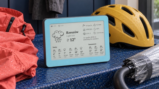
See the Brisa Daylo e-ink weather display on Etsy →
Match the metrics to the room
A kitchen display often serves several people and benefits from a broad morning summary: temperature, next change and rain. A hallway display is the last check before shoes and coat, so rain timing, wind and daylight can earn more prominence. A desk is read from closer range and may support an additional air-quality category or hourly detail without becoming illegible.
Placement changes the ideal density. Test the screen at the normal standing distance and in morning and evening light. If a label needs close inspection, enlarge it or remove a competing field. The buying guide covers screen type, viewing distance, update interval, mounting and ownership questions that sit outside this editorial choice.
Choose the right e-ink weather display for its real location →
A practical five-slot weather hierarchy
When the layout allows five information slots, use them in this order and stop as soon as the display answers the household question.
- Primary condition: current or feels-like temperature with a simple weather description.
- Next change: a later temperature or condition that could alter clothing or timing.
- Rain answer: chance, expected amount or a time window, clearly labelled.
- Exposure answer: wind or daylight when the plan takes place outside.
- Health context: local air-quality category or UV only when it is relevant and sourced.
After a week, ask what anyone actually used. Remove a field that nobody remembers consulting. If people repeatedly open a phone to answer the same missing question, consider adding that one instead. This small audit produces a better screen than a permanent list chosen from a specification sheet.
Where Brisa Daylo fits
Brisa Daylo is a 7.5-inch matte e-ink information display that uses 2.4 GHz Wi-Fi for online weather and air-quality information. Depending on the selected layout, it can show forecast, temperature, feels-like conditions, rain, humidity, wind, pressure, air quality and sunrise or sunset. It can attach to a suitable steel surface with its magnetic back or stand on a shelf or desk with the detachable rear support.
Brisa is not a sensor weather station and does not measure conditions in your garden. It is also not an emergency-warning channel. Online fields, providers and update timing can change, while an e-ink screen retains the last image if connectivity is interrupted. Check the update time and use current official warnings for hazardous or fast-changing conditions. Product capabilities and linked sources were checked on 22 September 2026.
OpenWeather: examples of current and forecast weather fields →
Explore Brisa layouts for weather, calendars and markets →
The best metric is the one that changes the right decision
Start small: temperature, the next meaningful change and one rain answer. Add wind, daylight or air quality because a person in the home can name the action it supports, not because the field exists. A display becomes calmer and more useful at the same time when every visible number has a reason to be there.
Questions about weather data on a home display
Which weather metrics are most useful at home?
Start with current or feels-like temperature and the next meaningful change. Add rain timing when it affects travel, wind for exposed activities, daylight for timing and air quality when local guidance could change outdoor plans.
Is rain probability the same as expected rainfall?
No. Probability describes the chance of measurable precipitation at a place during a period. Expected amount estimates how much may fall. Timing is a third question, so choose the value that supports the decision.
Is a connected weather display the same as a weather station?
Not necessarily. A connected display can show online observations and forecasts without measuring your property. Brisa uses online weather and air-quality data; it is not an outdoor sensor station.
Can I compare AQI numbers from different countries directly?
Not always. Air-quality indices use regional methods, pollutants, averaging periods and category thresholds. Read the index name, category, dominant pollutant and local official health guidance rather than comparing the number alone.